Measuring the Bubble (Depression Deja Vu)
 The media is calling this bubble the worst since the Great Depression. That sure sounds scary, but where are the facts? What makes them believe this bubble is so severe relative to other bubbles? Are there any facts to feed the panic or just pure fear?
I decided to take a look at some of the facts to measure the bubble and finally set some expectations about the size of the bubble. First I looked at the average housing pricing for the last 45 years. I pulled all of the information from www.census.gov which is a terrific place to gather macro economic information.
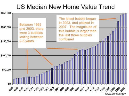
Just quick look at the chart, and it is easy to see where the bubbles have occurred. There were indeed housing bubbles in 1969, 1980, and a slightly larger bubble in 1989. Once each bubble hit, the decline in housing prices never lasted more than one year. Until now.
It is clear from the data, that there was a tremendous spike in housing prices in 2005. Unbelievable as it might sound, housing prices jumped over 13% in one year! This was followed by a 9% jump in prices in 2006. Somebody was asleep at the wheel in the Federal Reserve. Warning bells were going off all around them, and they did nothing.
Perhaps the scariest part of the bubble is its sheer size. Not only are the spikes larger than any other historical precedent, the bubble has persisted longer than anything in the last 45 years.
The only good news on this chart is that median home prices appear to have peaked in 2007, and although the data is not yet in, it is a good bet that 2008 will be less than 2007. So it is clear that we are beginning the downswing, the only question is how long will it last. And how severe will it be?
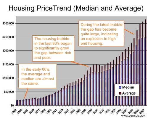
Next let’s take a look at the same chart but including the average house price along side the median. There is some speculation that the root of the housing bubble is related to laws encouraging mortgages to minorities. This chart rebukes that theory.
There can only be one reason why the average is growing faster than the median. HIGH END HOUSING. Eyeballing the numbers, I would bet heavily that million dollar homes are driving the bubble, not $100K homes to minorities.
But wait, there is one more piece of bad news. The average house price was still growing rapidly in 2007. Note: that the median had hit a plateau. In fact, looking at previous bubbles, this is the first time that the average behaved differently than the median.
I worry about the underlying dynamics of our economy if the average is so much larger than the median. It suggest that the gap between rich and poor is growing. Living down here in Brazil, I believe that one of America’s strengths in the 60’s and 70’s was an extremely strong middle class.
But I don’t want to get off track. So the housing data looks bad. Of course, this was entirely preventable, but there is indeed some empirical evidence that this bubble could be equal to that of the Great Depresssion.
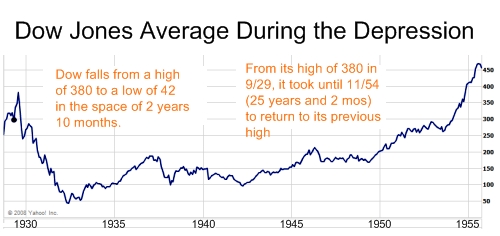
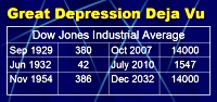
Lastly, let’s take a look at the Great Depression courtesy of Yahoo Finance. The Great Depression began in September 1929, when the Dow hit a peak of 380. The Dow did not hit bottom until close to three years later. Worse yet, it took over 25 years or a quarter of a century for the Dow to reach its pre-depression levels. Ouch! 25 years is a long time just to get back to break even on your stock portfolio.
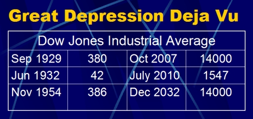
Although there are some indications that this financial crisis could equal the Great Depression. I personally believe that we can do much better. But for the pessimists in the group (and the media as well), here is a simple forecast using the Great Depression as a guide line. Once we see these numbers, it is easy to see why some people decided to keep their money in a mattress. Much safer.
Very good post, thanks!